
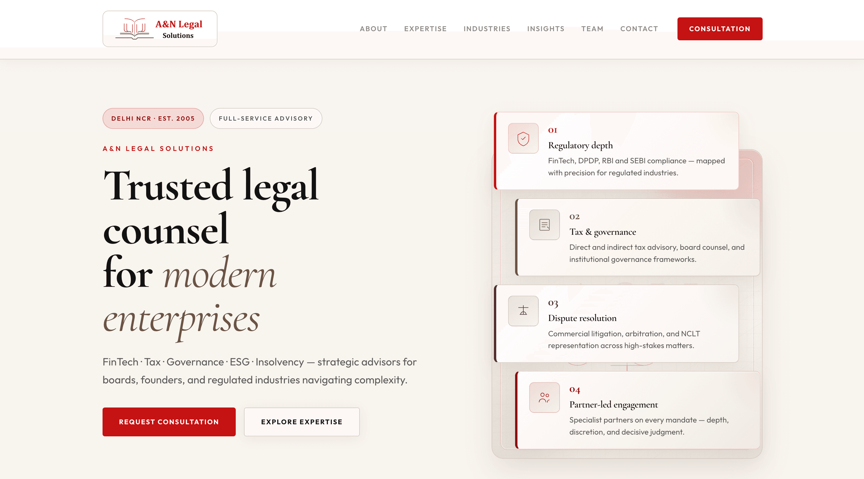
Build blueprint
The decisions behind the UI — with real examples.
Switch tabs to see what we built and why it works for this specific domain.
Examples
Information architecture
Designed for how enterprises evaluate legal counsel.
Hero → depth
Regulatory depth, tax & governance, disputes, partner-led engagement.
Practice areas
Carded lines like FinTech/Regulatory, DPDP, Governance, ESG, Tax, IBC.
Leadership
Partner profiles positioned as the decision anchor.
Context
Who it’s for, and what changed.
Users
Constraints
Problem
The friction we removed.
A&N needed a premium, compliance-aware public presence that communicates specialist depth (FinTech/Regulatory, DPDP, Governance, ESG, Tax, IBC) while staying scan-friendly for boards and enterprise decision makers.
Outcomes
- Clear practice-area discovery with specialist positioning
- Industry navigation for clients to self-identify quickly
- Credibility reinforced by leadership profiles + insights stream
Solution
The approach.
A premium information architecture: credibility-first hero → practice areas (carded, scannable) → leadership profiles → industry self-identification → trust strip (partner-led/confidential/sector depth) → insights for thought leadership → clear contact block.
Build notes
- Component-driven sections for consistent hierarchy and spacing
- Optimized for readability: short lines, strong headings, predictable layout rhythm
- Careful glow containment to avoid horizontal overflow
UX patterns
Design decisions that scale.
These patterns make the experience predictable under stress—whether it’s content discovery or day‑to‑day ops.
- Credibility-first hero with numbered proof pillars
- Practice-area cards optimized for enterprise evaluation
- Industry tabs for self-identification (FinTech, NBFC, SaaS, etc.)
- Trust strip emphasizing partner-led + confidentiality + sector depth
- Insights feed (alerts/articles) for 'research-before-call' behavior
Typography
Readable = credible.
Geist (Sans + Mono accents)
Modern, highly legible, and neutral—supports a premium tone while keeping dense legal content readable.
UI system
Color + spacing discipline.
Dark foundation with restrained accent gradients for trust signals—keeps focus on content and credibility.
Screenshots
What shipped.
Click to zoom.
Next
What we’d do next.
Tighten the workflow
Audit friction points and reduce steps for the key conversion/ops paths.
Make the system faster
Performance budgets, image strategy, and key-path caching for speed.
Scale with a design system
Tokenize spacing/type, build reusable components, prevent drift.
Start a conversation
Ready to talk about your next release?
Share where your product is today and where it needs to be in the next 6–12 months. We'll respond with a thoughtful point of view—not a canned pitch.
- 01
Share context
Where you are and what’s next
- 02
Get a point of view
Ideas, risks, and options
- 03
Shape the engagement
Scope, squad, and timeline
- Reply within 1–2 business days
- No generic sales deck
- NDA available on request
Prefer email? Use our contact page · hello@simegh.com
Project brief
~2 minutes · we read every submission