
Context
Who it’s for, and what changed.
Users
Constraints
Problem
The friction we removed.
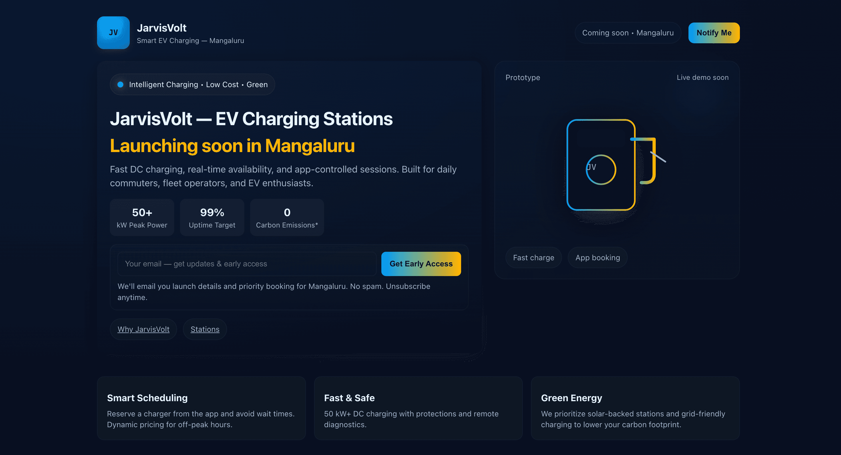
Needed a clean coming-soon page with early access capture and credibility cues.
Outcomes
- Clear early access funnel
- Credible launch posture
- Simple, maintainable surface
Solution
The approach.
Minimal landing with clear promise, KPIs, and lead capture.
Build notes
- Simple static landing
- Conversion-first layout
UX patterns
Design decisions that scale.
These patterns make the experience predictable under stress—whether it’s content discovery or day‑to‑day ops.
- Single-message hero
- Proof KPI strip
- Email capture form
Typography
Readable = credible.
Geist (Sans)
Clean readability for a minimal launch surface.
UI system
Color + spacing discipline.
Tech-forward accents with restrained surfaces.
Screenshots
What shipped.
Click to zoom.
Next
What we’d do next.
Tighten the workflow
Audit friction points and reduce steps for the key conversion/ops paths.
Make the system faster
Performance budgets, image strategy, and key-path caching for speed.
Scale with a design system
Tokenize spacing/type, build reusable components, prevent drift.
Start a conversation
Ready to talk about your next release?
Share where your product is today and where it needs to be in the next 6–12 months. We'll respond with a thoughtful point of view—not a canned pitch.
- 01
Share context
Where you are and what’s next
- 02
Get a point of view
Ideas, risks, and options
- 03
Shape the engagement
Scope, squad, and timeline
- Reply within 1–2 business days
- No generic sales deck
- NDA available on request
Prefer email? Use our contact page · hello@simegh.com
Project brief
~2 minutes · we read every submission